
Why Visitors Leave Your Website in Under 10 Seconds

When someone lands on your website, they don’t read it.
They scan it.
Within seconds, they subconsciously decide:
Is this clear?
Does this feel relevant?
Is this easy to understand?
Do I trust this?
If the answer isn’t obvious almost immediately, they leave — often without scrolling.
This isn’t impatience.
It’s how the human brain processes information online.

The 10-Second Reality of Online Attention
Visitors don’t arrive ready to learn.
They arrive distracted, busy, and cautious.
In the first few seconds, their brain looks for:
clarity
familiarity
relevance
safety
If it has to work too hard to understand what your website is about, it opts out.
This happens before logic kicks in.
People don’t leave websites because they’re bad.
They leave because they’re unclear.
Cognitive Overload Kills Curiosity
Many websites overwhelm visitors without realizing it.
Common overload triggers include:
too many messages at once
competing visuals
long blocks of text
unclear priorities
multiple calls to action
When the brain feels overloaded, it doesn’t try harder — it disengages.


Why “Good Design” Still Fails
A website can be beautifully designed and still lose attention.
That’s because design alone doesn’t equal clarity.
If visitors can’t immediately answer:
What is this?
Who is this for?
What should I do next?
Then even the best visuals won’t save the experience.
Visual Hierarchy Is the Silent Guide
Strong websites guide attention intentionally.
They use:
clear headings
intentional spacing
visual flow
contrast and emphasis
Visual hierarchy tells the brain where to look first, second, and third — without effort.
When hierarchy is missing, visitors feel lost.

Clarity isn’t boring.
Confusion is expensive.
The Role of Familiar Patterns
People trust what feels familiar.
That’s why websites that fight user expectations often fail.
Visitors expect:
intuitive navigation
predictable layouts
readable structure
When a website tries too hard to be different, it creates friction instead of interest.
Attention Isn’t Earned — It’s Protected
The goal of a website isn’t to impress.
It’s to protect attention.
That means:
removing unnecessary elements
reducing mental effort
simplifying choices
making the next step obvious
Attention is fragile — and once it’s lost, it rarely comes back.
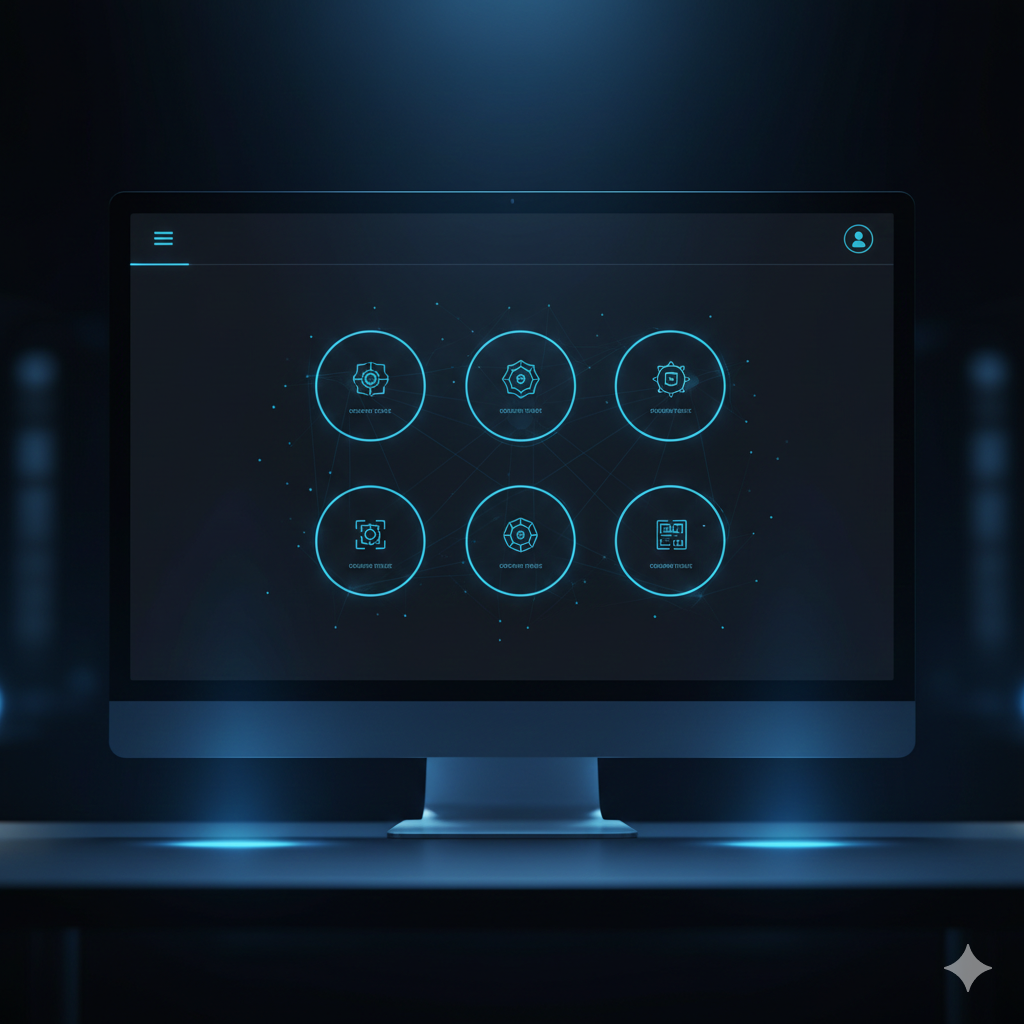
How Quantum Web Studios Designs for Attention
At Quantum Web Studios, attention is treated as a finite resource.
Websites are designed to:
communicate purpose immediately
guide visitors naturally
reduce cognitive friction
support effortless exploration
Design decisions aren’t aesthetic-only — they’re behavioral.

Signs Your Website Is Losing Visitors Too Quickly
Your website may be struggling with attention if:
visitors leave without scrolling
key pages have high bounce rates
users seem confused or disengaged
traffic exists but engagement doesn’t
These are clarity problems — not traffic problems.
Your website doesn’t need more traffic — it needs more clarity.
Quantum Web Studios builds websites designed to capture attention, guide behavior, and keep visitors engaged from the first second.